- Article
A better dashboard to drive Walenstadt grid
WEW, the Walenstadt distribution system operator (DSO), operates a grid monitoring system that continuously checks the power quality of all substations. These vast quantities of data are essential for WEW to comply with Switzerland’s strict regulations and to maintain grid infrastructure, but they are also cumbersome to work with. To make day-to-day operations easier for WEW’s technical staff, we asked ourselves a simple question: how can they access and interpret this data in a way that generates meaningful insights?
Cyrill Kästli, a bachelor student at ETH Zurich (supervised by Fabian Böhm and Benjamin Sawicki), worked with WEW’s Adrian Gröger and Felix Giger to develop a custom dashboard that can guide both the technical staff and our research. It’s a great example of how collaboration between academia and industry can result generate benefits for everyone: scientific thinking applied to practical needs.
Let’s take a look at how we put it together, and how it helps.
What needs to be measured?
Swiss DSOs are legally required to maintain grid voltage within prescribed thresholds. In areas like Walenstadt, where photovoltaic generation is widespread, periods of high solar production and low local consumption can drive excessive reverse power flows, creating a pronounced risk of over-voltage.
Beyond voltage, DSOs must also keep current and power flows across lines, cables, transformers, and breakers within safe limits. High currents accelerate wear as conduction losses generate heat, and sustained overloads can ultimately cause failures and outages.
Managing these risks requires continuous monitoring of key values and early detection of deviations. Among the many possible indicators, we found the 10-minute rolling average of minimum and maximum voltage, current, and power to be most crucial for grid stability.
How can we show it?
Good data visualisation starts with a clear story. Having determined the most important measurements to include in our dashboard, we spoke to WEW technical staff to learn how they would use it. We also looked for patterns or trends in the historical data from the substations.
To ensure the dashboard integrated smoothly into existing workflows, we connected with Janitza, the German vendor of WEW’s power quality measurement equipment. Their software, already linked to field sensors via automated feeds, offered a stable foundation, far more sustainable than building a fully custom system that would be difficult to maintain and sustain.
Before building the first prototype, we defined a colour palette based on the blue of the WEW logo. To this, we added three tones with commonly understood meanings: green for safe range, yellow for warnings, and red for errors.
Over a number of weeks, Cyrill developed various prototypes with varying levels of detail. Working closely with WEW, he simplified the interface and kept only the essential values. Graphs, such as those tracking reactive power or harmonics, not only took up a lot of space but were irrelevant for day-to-day operations of WEW grid, so we replaced them with compact text fields highlighting only exceptional events.
The result is an intuitive interface that delivers critical insights at a glance for technical staff, yet remains clear enough to be understood without specialist expertise.
Ta-da… the new dashboard!
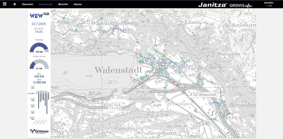
Logging on, the user lands on an interactive map that displays all substations as coloured dots. On the left, a data panel uses information from two reference plants—KW Töbeli, a small hydropower facility, and PV Halle am See, a large rooftop photovoltaic system—to provide a quick overview of local electricity production. Beneath this, users can track the live power flow at the point of common coupling, as well as the cumulative energy exchange with the higher grid level over the past seven days.
For each substation, and for any chosen date range, users can explore detailed performance data, including voltage, current, and active power, along with additional information relevant to grid planning. This makes it possible to capture even small events that might otherwise be overlooked. In the example below (see bottom left), a 90-minute under-voltage event occurred at the start of July: a case that warrants investigation of the root cause, and further action if needed.
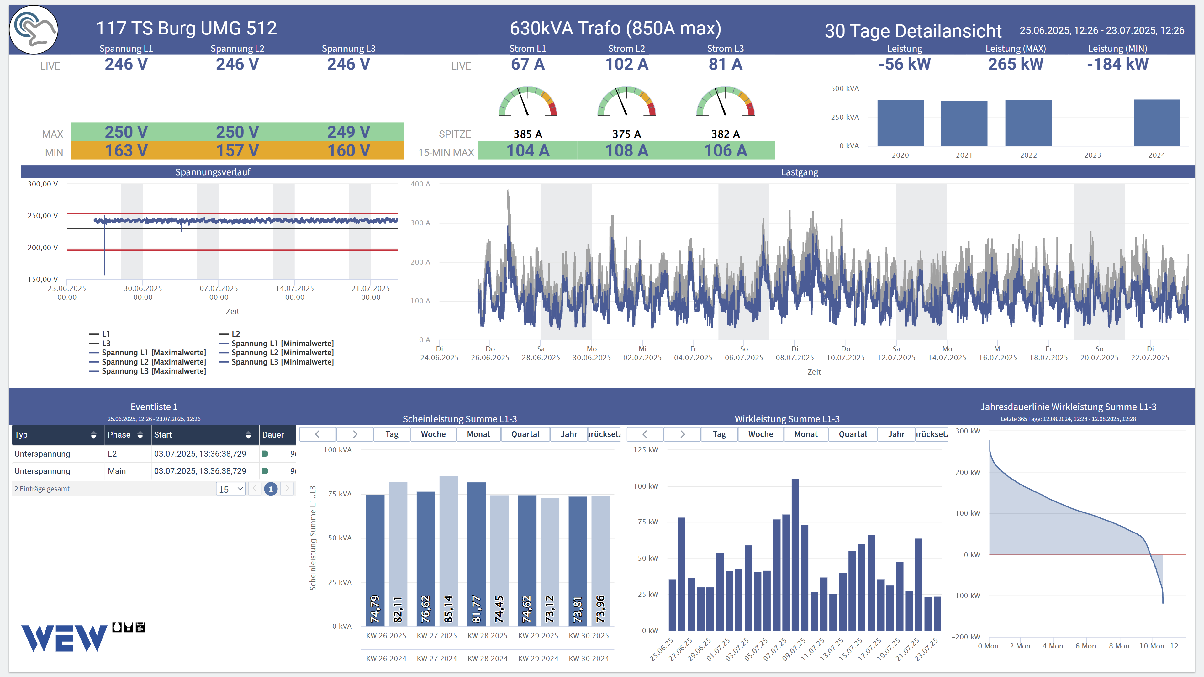
Checking the data for a recent event shows how the dashboard delivers. On 26 June 2025, a thunderstorm cut an overhead line, leading to an outage in parts of the town, as well as to a voltage disturbance along some substations. In the 30-day detail view covering this period, we see that under normal operation all values remain within defined limits (shown in green). During the storm, however, yellow values indicate that minimum voltage briefly dropped below the -15% limit.
The dashboard also compares aggregated apparent power load over recent weeks with historical data from previous years, helping to identify trends or patterns that could signal the need for grid extension.
Now fully embedded in the WEW team’s daily routine, the dashboard has become a valuable tool for both operations and research. Clear visualisation of carefully selected operational data supports efforts to keep the supply within limits while uncovering opportunities for improvement. At the same time, it provides WEW’s technical staff with sharper insights into grid maintenance—enabling smarter, more effective work.